Kiosks
Close
Kiosk Industries

With so much marketing competing for our attention today, getting your kiosk to stand out to potential users takes work.
This can be more involved than simply using the brightest colors or craziest designs. While that might help a kiosk to stand out, it can just as easily create confusion if the kiosk design is not connecting to the brand.
The good news is that there are many ways to create an attention-grabbing kiosk without abandoning brand identity.
One often overlooked aspect of kiosk design is the shape, which can do more than just garner the attention of potential users. It can also set up a brand-specific environment by influencing the way the kiosk, and thus the brand, is perceived.
When looking to make a visual statement, businesses should consider using a silhouette that sets the stage for how they want to make consumers feel.
Utilizing whimsical designs may make sense for a children’s brand, while a spa kiosk is more likely to go for a subtle effect with softer shapes. A kiosk marketing edgier brands or products, like sports cars or video games, is more likely to use sharper angles and square outlines to give off a more dynamic feel.
Humans see the overall shape before consciously deciding whether they want to explore further, and that can impact the effectiveness of kiosk design. Kiosks with more aesthetically committed silhouettes tell a more compelling and memorable story.
When considering colors for a kiosk, it’s necessary to first consider the brand color.
The impression of brand color may make a bigger impression on consumers than even a brand name because of the emotional connection people feel to color. This powerful breadcrumb allows people to recall a brand for years to come.
Certain brand names are almost synonymous with their brand color. Consider The Home Depot orange, Target red, or even Walmart blue. A simple glance of color out of the corner of one’s eye can alert them to the brand’s presence.
Brand color isn’t the only avenue in which color can effectively be used for kiosks. Color, much like shape, can portray a particular mood or create a certain atmosphere. Cool tones give off a sense of calm, while fiery tones, such as red or orange, are commonly associated with passion or a call to action. Neon or electric colors exude energy, while neutrals come off as more natural and earthy.
Something else to consider is where the kiosk is going to be placed, particularly if it will be outdoors versus indoors. Color can be a great way to make an outdoor kiosk pop, particularly when the kiosk is more likely to be used during daytime hours. The natural light of day allows a kiosk’s colors to draw the eye’s attention without relying heavily on added lighting effects.
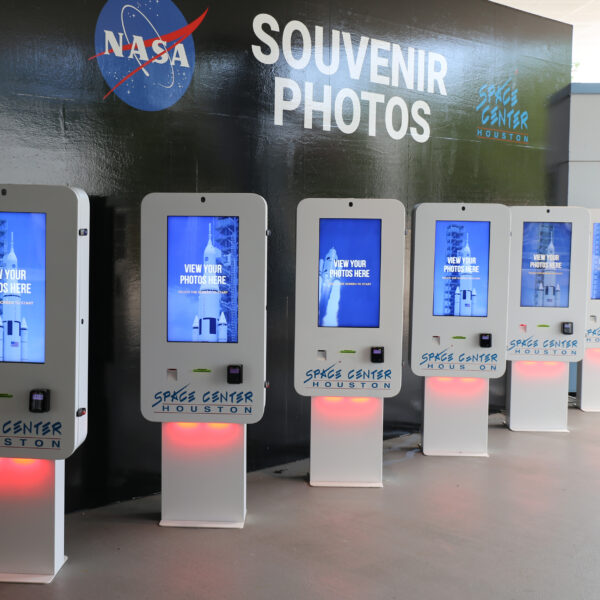
Lighting can do wonders when it comes to bringing awareness to a kiosk, specifically the use of LED lights. Beyond simply enhancing a kiosk’s aesthetic, the saturated color provided by LEDs can inexpensively enhance brand presence, changing the way companies can brand their kiosks.
Before LED lighting, kiosks used fluorescent tubes or incandescent bulbs as a light source, however, the colored light provided by these sources was often dim and rather pale. With the introduction of affordable LED lighting, the colors became much more vibrant and customizable. Instead of putting white light through a colored filter, LEDs are able to directly produce light in a particular shade, while simultaneously outlasting traditional florescent and incandescent lighting options.
Not only can brand colors be easily matched but motion effects are commonly available at competitive prices, too. LED’s can prompt users toward particular components on a kiosk, signaling the next required action, such as where to insert a coupon or take a receipt.
Another advantage to using LEDs is the optical-illusion-like effect they can create. For instance, a halo of light from underneath a kiosk monitor or over the kiosk machine can separate it visually and make it appear to ‘float’ over other surfaces.
Remember to take into account the intended placement of the kiosk. In general, outdoor lighting really shines at night, whereas for indoor applications, LEDs are more than adequate in nearly any lighting condition.
Lighting has come a long way. Today, LEDs can easily dial into a variety of colors that were impossible only a few years ago, and it’s only getting better.
Making your kiosk stand out in an environment can be a challenge, but with advancements in today’s technology, coupled with confident branding, you’ll be well on your way. Knowing how to skillfully utilize shape, color, and lighting are some simple and effective methods in making sure that your brand’s kiosk leaves a memorable mark in the minds of its intended audience.

